Dev Anatomy of a Storefront Component
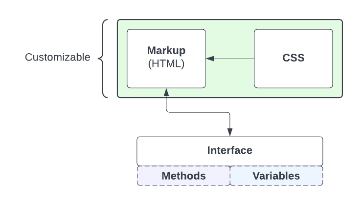
Storefront Component Anatomy
Storefront components are interactive UI elements to enhance your customer’s buying experience by providing additional information and capabilities to your site. Let’s talk about how they work and how to customize the look and feel to your shop’s needs.
The Parts of a Storefront Component
This section describes the three different parts of a Parcelify Storefront Component and how they impact you as a developer.
HTML
Storefront Components are written in HTML. HTML defines what your customers will see and interact with on your store’s webpages.
The top level of a component’s HTML is a Web Component element. This element contains the component as a whole and provides an interface to access data and perform actions against that data, but does not provide any visual representation.
The HTML may reference any methods or variables that are provided by the Storefront Component you are implementing. These references will be in the form of HTML attributes starting with @ or x-. Please refer to the Interface section below for more information.
Here is an example component that will display a greeting to the customer when they enter their name. parcelify-greeting-component is the root element which contains all of the component’s HTML which is fully customizable.
<parcelify-greeting-component>
  <input type="text" x-model="name" />
  <input type="submit" @click="doSomething()" class="black-border" />
  <div x-show="somethingHappened" x-text="`Hello ${name}!`"></div>
</parcelify-greeting-component>
CSS
Components are styled with CSS. There are no restrictions or special features here, just plain CSS.
You can use any CSS class provided by the webpage to style the component elements, simply add the class names on the elements within the HTML elements.
We recommend to always specify the component element name at the top of your CSS selectors when customizing components. This will ensure your styling applies to the intended component’s elements only.
Here is a basic CSS stylesheet example for our parcelify-greeting-component:
parcelify-greeting-component {
  display: inline-block;
  margin-bottom: 15px;
}

parcelify-greeting-component > .black-border {
  border: 2px solid black;
  padding: 5px;
}
Interfaces
An Interface is a collection of methods and variables. These provide your HTML with data to be rendered and allow it to perform operations.
Written in Alpine.js, the Interface members are accessible through HTML attributes. This arrangement allows you to fully customize your HTML without losing functionality or having to write any JavaScript.
Using our parcelify-greeting-component we will first outline its Interface then break down each of its elements by how they interact with that Interface.
Interface
name- Variable that contains the value of a NamesomethingHappened- Variable that contains a boolean valuedoSomething- Method that performs an action
Interface Usage
<input type="text" x-model="name" />is a simple text input field. Thex-modelattribute is a two-way binding mechanism. This means that the input field will contain the value of the Interface’snamevariable and will also set thenamevalue if the value of the input field changes.<input type="submit" @click="doSomething()" class="black-border" />is a button that will invoke the Interface’sdoSomethingmethod when clicked by using the@clickattribute.<div x-show="somethingHappened" x-text="`Hello ${name}!`"></div>is only rendered when the Interface’ssomethingHappenedvariable returns true by using thex-showattribute. Thex-textattribute will set the inner text of the element to a greeting customized with thenamevalue.
Conclusion
Storefront Components are broken up into three distinct parts - HTML, CSS and an Interface. The first two are fully customizable. HTML in turn leverages the Interface members to give the component its functionality.