Documentation Storefront ComponentsIntroduction
Introduction to Parcelify Storefront Components
If you’re anything like us, you care deeply about the buyer experience. You know that the easier you make it to learn about what products, specials, and what rates are available, the easier it is to connect people to the things they actually want to buy!
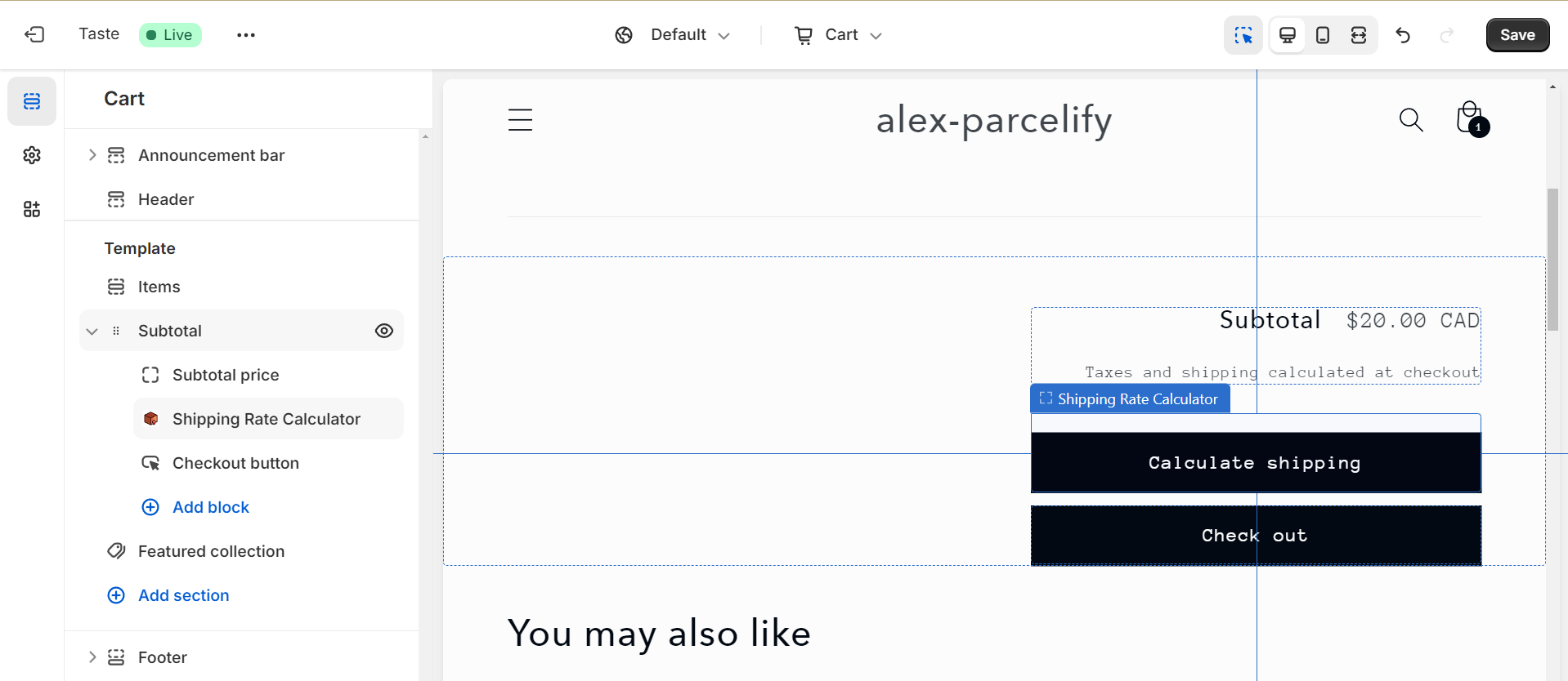
Parcelify Components give you the tools to provide this experience to your customers. Our first component is our Shipping Rate Calculator. With it you can show your customers what rates are available before they check out:
..but this feature is so much more than a rate calculator! Parcelify Components are designed to be used out-of-the-box, or by customizing them using the provided assets and just a little Alpine.js.
To see what components we currently offer, click here
Enabling components
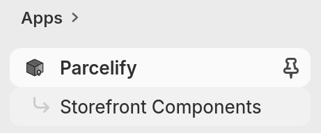
Start by opening Parcelify. Navigate to your Shopify admin panel, select Apps, then click or type ‘Parcelify’. In the left-hand navigation menu, underneath Parcelify, you will see Storefront Components listed. Select this option to view available components.
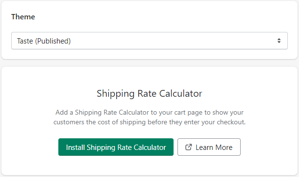
You are able to select which theme you install components into. Your shop’s active theme will have the text (Published) next to it and is selected by default.
Once you have your desired theme selected, browse through our available components until you find one you wish to add.
Next, click the Install button on the component.
(In the background, this step will upload the files necessary for you to include the component in your theme but does not make any changes to the appearance of your site.)
After that, you will be presented with the following modal:
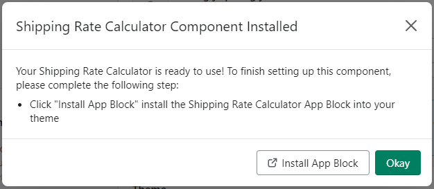
This component is now ready to be placed on your theme. If you have a 2.0 Shopify theme, you should be able to place it with the Shopify theme editor. Click the [ Install App Block] button to open your theme editor. Otherwise, if you want to edit and place the component by hand, follow the manual installation instructions below.
-
For a general overview of the Shopify Theme editor, see the following link:
Shopify Theme Editor -
For specific information about working with app blocks:
Shopify app blocks
Manual installation
There are a few reasons you may choose to manually install a component instead of placing it as an app embed in your theme:
- You do not have a 2.0 theme so app blocks are not supported
- You wish to finely customize the look or language of a component
- You wish to change the functionality of (or perhaps even rewrite) the component itself
Example
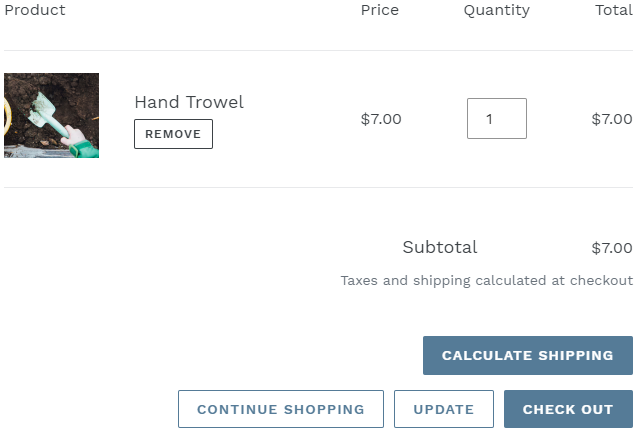
Let’s suppose you are installing our Shipping Rate Calculator. This component will show your customers what shipping rates are available based on what is currently in their cart and the location information they provide. We’ll assume you are trying to place this component just above the checkout button, similar to the screenshot at the top of this page.
Unfortunately, you discover your current theme does not support 2.0 theme extensions. Rather than change to an entirely new theme, you can place this component directly.
Upload Assets
- Click install next to the component on the main Parcelify page
- Head over to the Component Catalog and click the heading for the component you wish to install
(this step brings you to the API for that component) - In the Asset Files section, download the appropriate assets for your theme. If your theme is not listed, use those listed under “All Themes”
- Go back to your Shopify admin and click on your online storefront
- Click the horizontal ellipses […] character to the right of your theme, then click Edit Code
- Upload these files to your theme
Asset files listed in the component API also tell you where they should be installed. A file listed as:
assets/example.css should be named example.css placed in the Assets folder.
Note: Some files must be created manually in the Shopify theme editor. If you click ‘Add new’ under a folder and do not see an option to upload a file, simply create a new file with the correct name and copy+paste the contents of the asset you downloaded previously.
Place the component
- Now that you’ve uploaded the assets, go back to the component API page one more time
- Copy the code listed under “Component Snippet”
- In the Shopify Theme editor, find where in your theme you wish to place this component. In this example we’re using the Debut theme, so we’ll open cart-template.liquid in the editor.
- Please note: your theme’s filenames and code structure may vary from the example in this tutorial. Always take caution when making theme modifications and preview your shop after making any changes.
- Since the checkout controls are towards the bottom of the cart page, we scroll down the template file and see a section called Cart Footer. Nested within is a class called cart__submit-controls
- We want this component to appear above the controls, so we drop the code snippet in right above and save this theme. That’s it!
Fully installed component
Once a component is installed in Parcelify and you’ve told us where you want it to appear, open up your shop and give it a try. Here’s what the component in the previous example looks like at checkout:
Now that you know how to install and place components, continue to the next page to see the components we’ve made for you!