Documentation Storefront Components Theme Editor
Component Theme Editor
Your shop is a unique presentation of who you are, and your Parcelify Components should reflect that.
To that end, we are proud to introduce our Component Theme Editor!
Where is it?
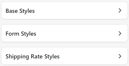
After installing a component, click [ Customize]. You can find this button under the component entry on the Parcelify front page:
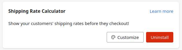
(Not sure how to install a component? See our Install shipping rate calculator documentation for an in-depth example)
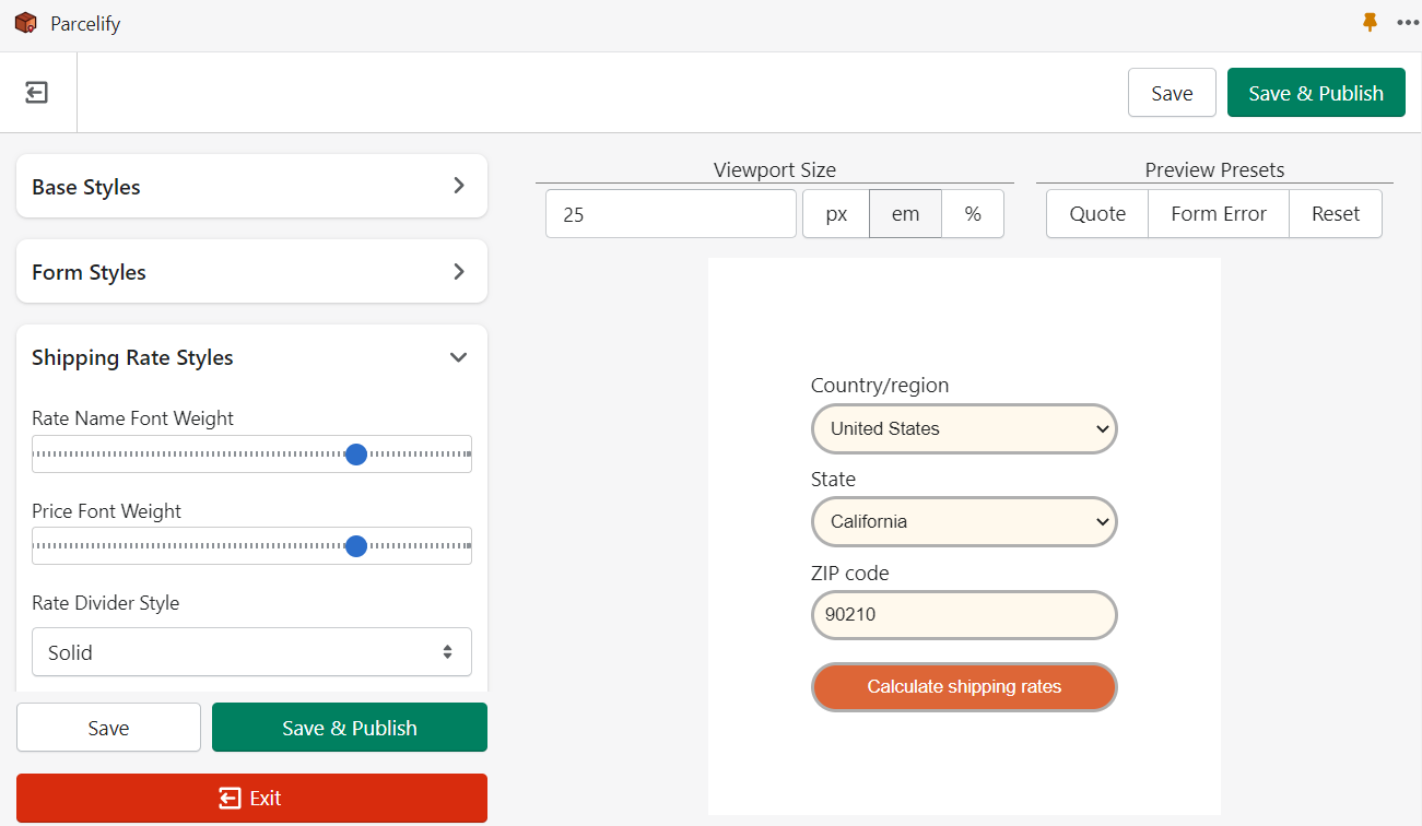
Controls
The Viewport
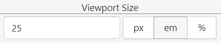
This control helps you tailor how much area the example component is allowed to expand into.
Preview Presets
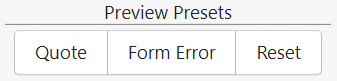
Each button here represents the different states a component may display. When clicked, the component will change to the corresponding state. This makes it easy for you to customize all the different parts of a component your customers will see.
Styles
Finally, the fun part: the controls under Styles allow you to customize what your Storefront Component looks like to your customers. Any changes made here are reflected immediately in the viewport.
What controls are present and the kind of changes you can make depend on what Component you are customizing, so let’s look at an example from our Shipping Rate Calculator.
Shipping Rate Calculator Example
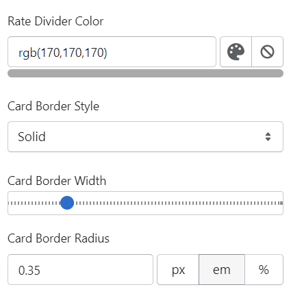
Rate Divider Color
This is a color control. You can enter RGB values to dial-in an exact color, or click the painter palette to open a color picker
Card Border Style
This dropdown allows you to pick from a pre-determined set of options. In this case, you can select whether the card border for this component is solid, dotted, dashed, or outlined with a set of double lines.
Card Border Width
A straightforward slider you can move left or right to control, in this case, how thick the card border is
Card Border Radius
For more complex settings - or setting that do not lend themselves to other controls well - we provide a simple text box. This text box allows you to set how rounded the corners of the shipping quotes card is in pixels (px), ephemeral units (em), or by percentage (%).
These controls may have different names and values depending on where you find them, but they all work in a similar way.
Saving your work
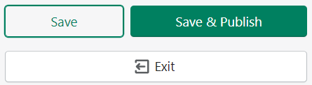
Save
Clicking [Save] will store the changes you’ve made without updating the Component style on your site.
Save and Publish
When everything looks the way you want, click [Save and Publish].
If this is the first time you’ve customized this component for this theme, you will be presented with a dialog box asking you to complete installation. Clicking the “Install App Block” will ensure you have the component installed into your theme.
Exit
Exiting will return you to the Parcelify homepage in your Shopify admin panel. If you’re not going to be publishing changes right now, make sure to [Save] your work.
…Now get out there and design some cool Components!