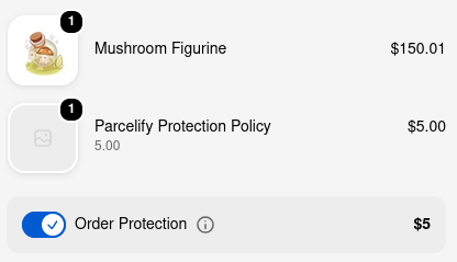
To sign up, please reach out to us at protect@cleverfew.co.
Protect components
Once Parcelify Protect is enabled, add a component so customers can see that protection is available. Components are small UI elements you place on your storefront or in Shopify checkout, like our Protect toggle, checkout button, or a terms of service panel. Which ones you need depends on how you chose to offer Protect on the Settings page.
Finding your components
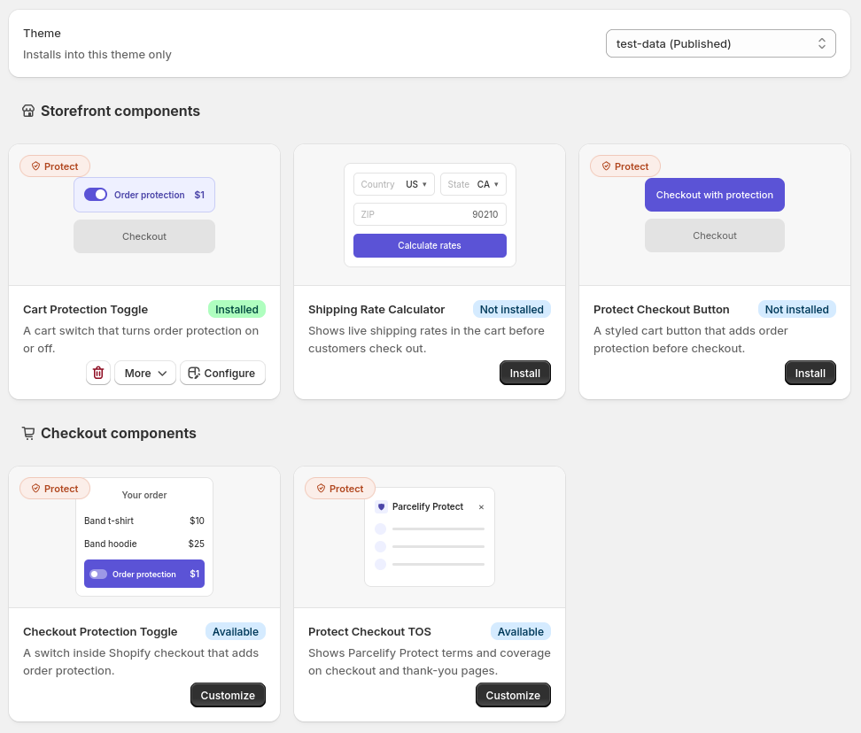
At the top of the Storefront Components page, the Theme dropdown controls which theme your components install into. It defaults to your shop’s live theme, shown with a [Published] label.
- Open Parcelify in your Shopify admin.
- Select Storefront Components from the left-hand navigation menu. This opens the full component catalogue.
- Browse the catalogue for the Parcelify Protect components listed below.
Components you install onto your theme show [Install] until you add them. Components that run inside Shopify checkout already show [Available] with [Customize], since there’s nothing to add to your theme.
Tell your customers they’re protected
Everyone
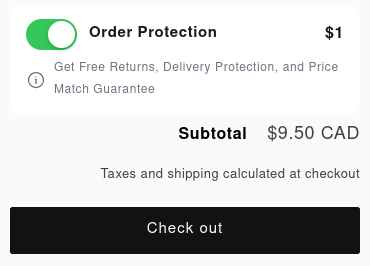
Cart Protection Toggle - Show protection on the cart page with a toggle your customers can select.
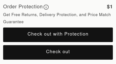
Protect Checkout Button - Add a separate button on the cart page that automatically applies shipping protection.
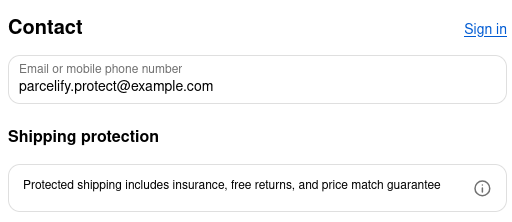
- Protect Checkout TOS - Shows Parcelify Protect terms and coverage on the checkout or thank-you page.
Shopify Plus
Checkout Protection Toggle - A switch on your checkout page that adds order protection.